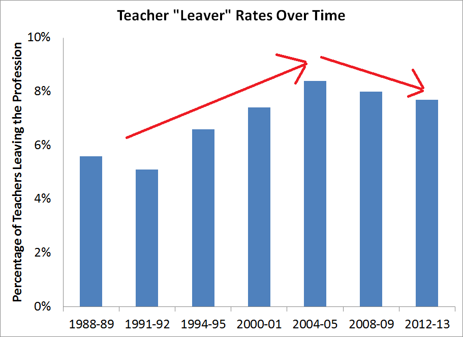
Despite the conventional wisdom, there’s very little evidence that current education policies are driving teacher turnover. In fact, although the teacher turnover* rate rose in the 1990s and 2000s, more recently it's started to fall. This change can be traced to changing demographics of the teacher workforce as a whole.
To understand how these trends are shaping the teacher workforce, let's start with the overall national data. The graph below comes from a post I wrote last fall showing national, longitudinal data from the National Center for Education Statistics (NCES). It tracks the percentage of teachers in a given year who leave the profession. As the arrows show, there was a general upward trend through most of the 1990s and 2000s, but that trend has reversed in more recent years:
What was behind the rise in teacher turnover in the first place? It can't be blamed on policy changes like No Child Left Behind (NCLB) or Common Core or teacher evaluations, because the upward trend predates all of these policies. The conventional wisdom on NCLB in particular is contrary to what the evidence actually says. But what about more vague concepts like "respect" for teachers? That's harder to pin down, but there's no evidence there was ever some sort of golden era where America teachers received the respect or pay they deserved.
The simpler, more plausible explanations for the changes go back to human nature and demographics. After all, teachers are human, and they tend to behave like all other workers. Turnover tends to rise during economic expansions, when employers are hiring, and it falls during recessions, when hiring dries up. Worker life cycles matter as well. Inexperienced workers, including teachers, tend to have higher turnover rates, and so do older workers approaching retirement. All else equal, a less experienced, older workforce is likely to have higher turnover rates overall, even if retention rates for particular groups of workers stay exactly the same.
The teacher workforce has changed in exactly these ways. As Richard Ingersoll has documented, today’s teaching workforce is both “greener” and “grayer” than it was in the past. That is, the teacher workforce became both older and less-experienced than it had been. These alone are conditions that would cause overall turnover rates to rise.
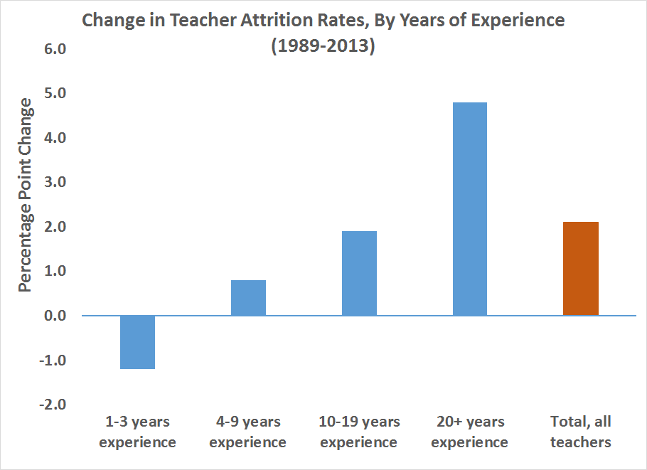
But there's even more going on underneath those broader trends. Turnover rates for inexperienced teachers have been falling, not rising, while turnover has risen among more experienced teachers. The graph below shows the change in turnover rates from 1987 to 2012 by years of experience. The turnover rate for teachers with 1-3 years of experience fell by 1.2 percentage points during this period, whereas the rate among teachers with 20 or more years of experience increased by 4.8 percentage points.
In terms of annual turnover rates, teachers with 20 or more years of experience are now the most likely group of teachers to leave. From 1987 to 2012, the turnover rate for this group rose from 6.6 to 11.4 percent, compared to the overall change for all teachers from 5.6 to 7.7 percent.
Most of this is due to retirement, because similar turnover patterns emerge when looking at teacher age. Over the last 15 years, the only age group of teachers with rising turnover rates is those over the age of 50. In its regular teacher surveys, NCES asks departing teachers why they are leaving the profession, and the percentage of those teachers identifying retirement as their next destination has risen from 24.8 percent in 1988-9 to 38.3 percent in 2012-13.
This reflects both an aging teacher workforce and a reduction in the age at which teachers can retire. As Ingersoll notes, our teacher workforce was “graying” for most of the last 25 years, driven both by existing teachers aging into the profession and an increase in the hiring of older “new” teachers. A large group of older career-switchers entered teaching in the late 1980s, and the result is the chart below. It comes from Ingersoll’s report, and it shows the percentage of teachers who are age 50 or older (the chart includes public and private teachers, but private school teachers tend to be much younger, so a similar chart for public school teachers only would likely be even higher). As the chart suggests, we already passed a peak in the “graying” trend, which may be one reason overall turnover rates have started to fall.
It’s also no coincidence that the “graying” of the teacher workforce roughly corresponds with the rise of the Baby Boom generation. It shouldn’t be a total surprise that we’d see large numbers of teacher retirements as this generation ages out of the teaching workforce. (If you want to see this visually, check out these graphics from my colleague Leslie Kan on changes in Illinois’ teacher workforce. The retirement of a large cohort of veteran teachers is clearly visible in the graphs.)
This period also coincides with states lowering their retirement ages. From the 1980's to the early 2000s, the median state lowered its retirement age for teachers from 58 to 55. Veteran teachers have invested nearly a full career in teaching, and teacher pension benefits tend to increase steeply as teachers approach retirement age. Evidence from California and Missouri suggests teachers know about these late-career pension incentives and act accordingly.
So while it may be tempting to blame teacher turnover on current education policies, demographics and rising retirement rates offer a more plausible explanation.
*Throughout the post I refer to "teacher turnover" as the percentage of teachers who leave the profession in a given year. This is what NCES calls the "leaver" rate. Another group of teachers move between schools. That churn certainly has a real effect on schools, but what I'm interested here is teachers who actually leave the profession altogether.

